Aftermath NYC
Curated, Upscale, and Vibrant Ambiance
Alignment of the Aftermath NYC brand identity across digital and print touchpoints to elevate user experience, engagement, and business growth.
Note:To respect research participant confidentiality, some research has been omitted in its entirety.
Industries
Hospitality
Tools
Figma
Framer
Good Notes 5
Canva
Work
Research
Graphic Design
Web Design
Collaborator(s)
Co-Owner
Project Manager
Breathing New Life into a Venue's Digital and Print Presence
After their last venture, the co-owners asked, "What's next?" Their answer: Aftermath NYC. Renowned for its craft cocktails, beers, and curated vinyl experience, the redesign unified their online and print touchpoints with its in-person experience , achieving a 20% faster website, 30% increase in mobile traffic, and a 50% boost in user satisfaction.
Unveiling the Challenges
The challenges I uncovered were costing Aftermath NYC in terms of user engagement, mobile traffic, and ultimately, reservations begat by:
Brand Misalignment: A disconnect existed between the physical space's ambiance and its digital representation
Usability Issues: The website lacked accessibility, responsiveness, and clarity, hindering user engagement
Performance Bottlenecks: Slow page load times and a cumbersome reservation process further frustrated potential customers
Crafting a Cohesive Brand Experience
Embarking on a comprehensive redesign journey, we conducted stakeholder interviews and contextual inquiries, immersing ourselves in the Aftermath NYC world. Key insights emerged:
Desire for Authenticity: Customers craved a digital experience that mirrored the lounge's intimate, curated atmosphere
Emphasis on Usability: A seamless, intuitive interface was crucial for both desktop and mobile users
Performance Optimization: Speed and efficiency were paramount to capture and retain visitor interest
Designing with Purpose
Armed with these insights, I set out to craft a holistic brand experience:
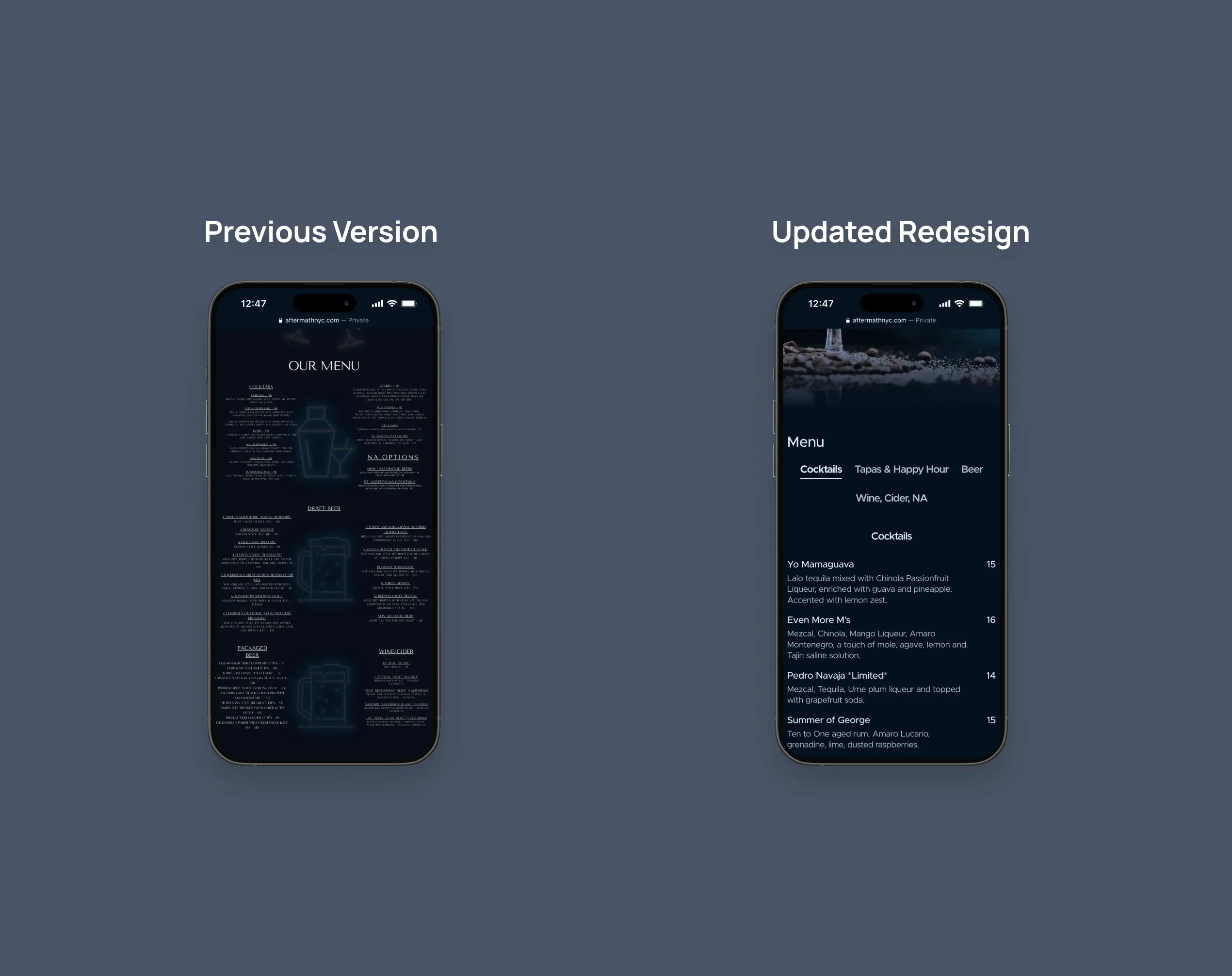
Website Overhaul: We reimagined the website, prioritizing accessibility, responsiveness, and a design language that resonated with the brand's soul
Print Menu Rejuvenation: The physical menu received a facelift, aligning its aesthetics with the brand's visual identity and enhancing readability
Brand Consistency: Stationery and business cards were redesigned to reinforce the brand's cohesive image across all touchpoints
Typeface Harmony: We established a unified brand voice with the selection of the Metropolis typeface, its clean lines and accessibility echoing the lounge's welcoming ambiance
Menu Metamorphosis: The print menus were reborn in Canva, with their newfound hierarchy and visual clarity inviting effortless exploration
Digital Gateway Reimagined: The website, once a mere online presence, has blossomed into a captivating digital extension of the Aftermath experience, weaving social media's vibrancy, intuitive navigation, and brand-consistent aesthetics into a tapestry where discovering the menu and securing a reservation is as effortless as stepping into the lounge itself
Metrics of Transformation: Success was more than just a vision—it was a quantifiable goal and set our sights on ambitious targets: a 30% surge in click-through rates, a 40% expansion in overall traffic, a 20% reduction in page load times, a 30% boost in mobile engagement and conversions, and an impressive 50% increase in user satisfaction
The Power of Iteration
Throughout the design process, stakeholder feedback was paramount. Iterations refined the footer, mobile layout, and digital menu, ensuring the final product exceeded expectations.
Early Success and Future Horizon
While data collection is ongoing, early indicators paint a promising picture:
Performance Boost: Page load times have decreased by over 20%, enhancing user experience
User Satisfaction: Over 60% of users express positive sentiments towards the new website
Streamlined Reservations: More than 70% of users find the reservation process easier and more intuitive
Key Takeaways and Future Aspirations
This project underscored the power of aligning UX with brand strategy. It also solidified the value of no-code tools like Framer for rapid prototyping and deployment.
Looking ahead, I look forward to further enhancements:
Accessibility Refinement: Ensuring the website is fully inclusive for all users
SEO Optimization: Expanding organic reach and discoverability
Dynamic Content and Microinteractions: Infusing the site with engaging elements that further elevate the brand experience
Expand Revenue Streams: Launch e-commerce to boost merchandise sales
Final Thoughts
The Aftermath NYC transformation exemplifies the transformative power of thoughtful design. By listening to users, prioritizing brand consistency, and embracing iterative processes, a beloved lounge bar solidified its digital presence and created a seamless brand experience that resonates both online and offline.


